

Redesigning Software Pages Around the People Who Use Them

As part of Bentley Systems’ “3.0” initiative—a company-wide effort to modernize digital experiences—I led a full rethink of our software product pages. The goal: transform them from generic marketing hubs into clear, task-oriented guides rooted in user intent, real-world workflows, and pain points.
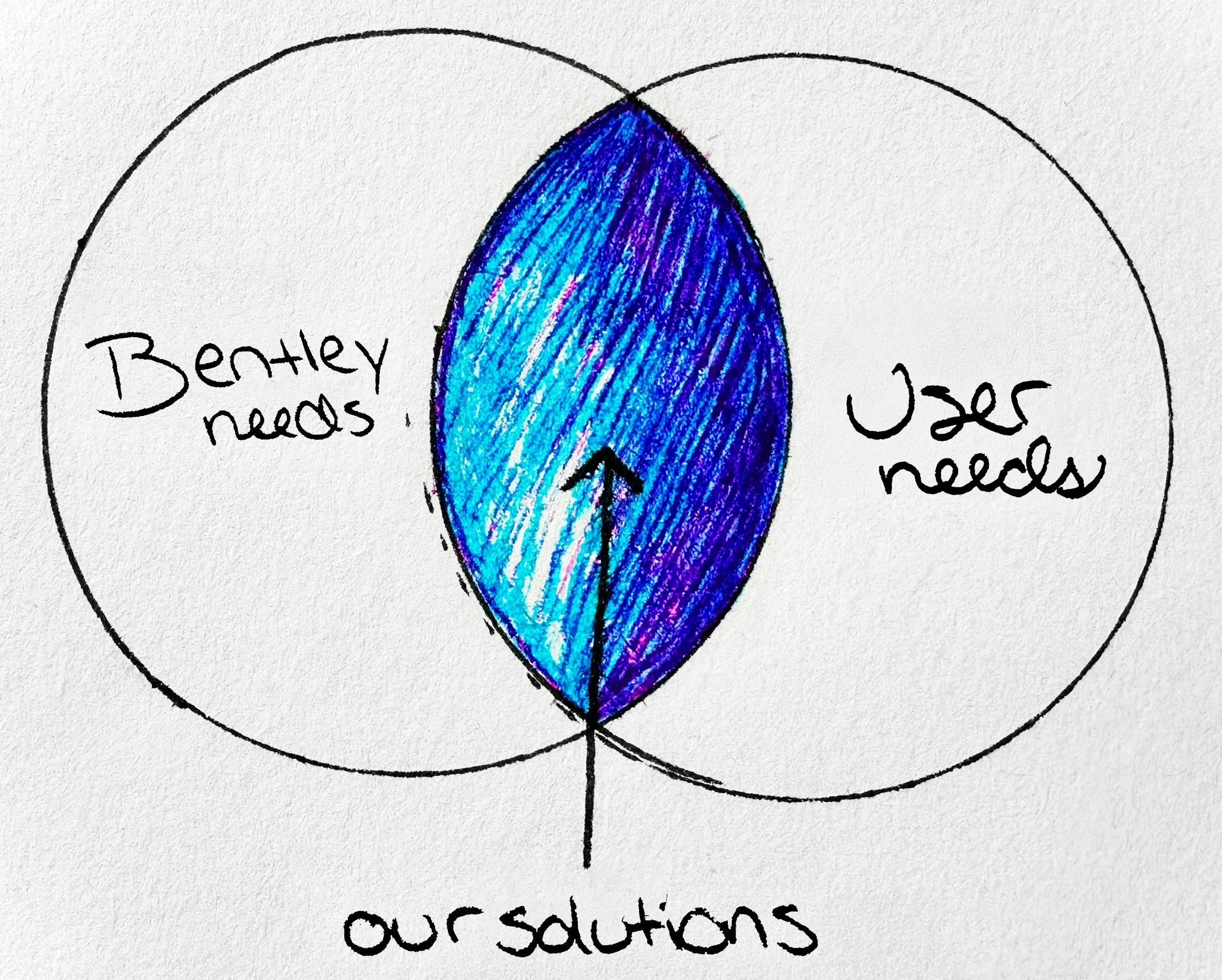
What’s the purpose of a software page?
We started with a simple but often overlooked question: What is this page really meant to do—for Bentley and for the people using it?
Bentley needs: Conversions, trust, a clear value story
Users needs: Straight answers, easy comparisons, clear next steps
We designed at the overlap—where business goals meet real user needs.

Discovery Overview
How we got our insights
To rethink the software page experience, we started with deep input from across the org and user base:
Discovery workshop with 13 SMEs
Persona development, Jobs to Be Done
Data analysis, competitor audits
Review user testing conducted by consulting partner
We turned raw input into clear themes that shaped the future-state experience.

Insight #1:
Users don’t always understand what the product actually does.
“I’m still kind of confused what they do. It doesn’t say anywhere it’s CAD or 3D modeling.” — CAD Manager
How might we… make our product benefits instantly clear to new and returning users?
What we did:
We led with outcome-driven copy and real-world proof points. Stat blocks, product screenshots, and short videos replaced dense feature blurbs. We also rewrote hero and intro sections to be direct and benefit-first and tested the content before turning live.

Insight #2:
Prospective users struggle to compare products.
Discovery workshop participants explicitly asked for tier comparisons and pricing clarity.
How might we… make it easy to understand which product is the right fit?
What we did:
We built a tiered comparison framework with simplified pricing cards, consistent bullet-point features, and clear CTAs like “Compare Plans.” We added a toggle for student/educator info and future plans include filtering by job role. User testing the design, content and content heiarchy as well for external validation.

Insight #3:
Students and educators feel underserved.
Journey mapping exercises exposed that these personas are not spoken to at all in current software pages.
How might we… create clear entry points for students, educators, and early-career users?
What we did:
We created persona-driven entry points and added tailored CTAs. Educational access details now appear higher on the page, and we’re exploring beginner-friendly onboarding flows. Outside validation with user testing these groups as well.
The Problem:
Users came with questions. We gave them a brochure.
Navigation was cluttered, CTAs underperformed, and personas like students and educators were nearly invisible.
Stakeholder feedback and analytics confirmed the issue: content was dense, value unclear, and the product story disjointed.
It was time for a total reset, not just a refresh.

Discovery Phase:
We started with real users—not assumptions.
Methods used:
Discovery workshops with SMEs
Jobs to be done
Personas
Data analysis
Competitor audits
User journey mapping